Products used:
- Kryolan Supracolour Palette
- Illamasqua Loose Powder in 010
- Kryolan Eye Shadow Variety Palette in V2
- Illamasqua Liquid Metal Palette
- Foundation Brush
- Kabuki Brush
- Powder Brush
- Blending Brush
- Disposable Mascara Wand
- Angled Brush
Health and safety:
- Cover model
- Check for contact lenses
- Check for and ask model about any skin complaints or allergies
- When applying shadows or mascaras, ask model to close eyes and work carefully
- Make sure all brushes are clean
- Wash hands
- Do not double dip with product
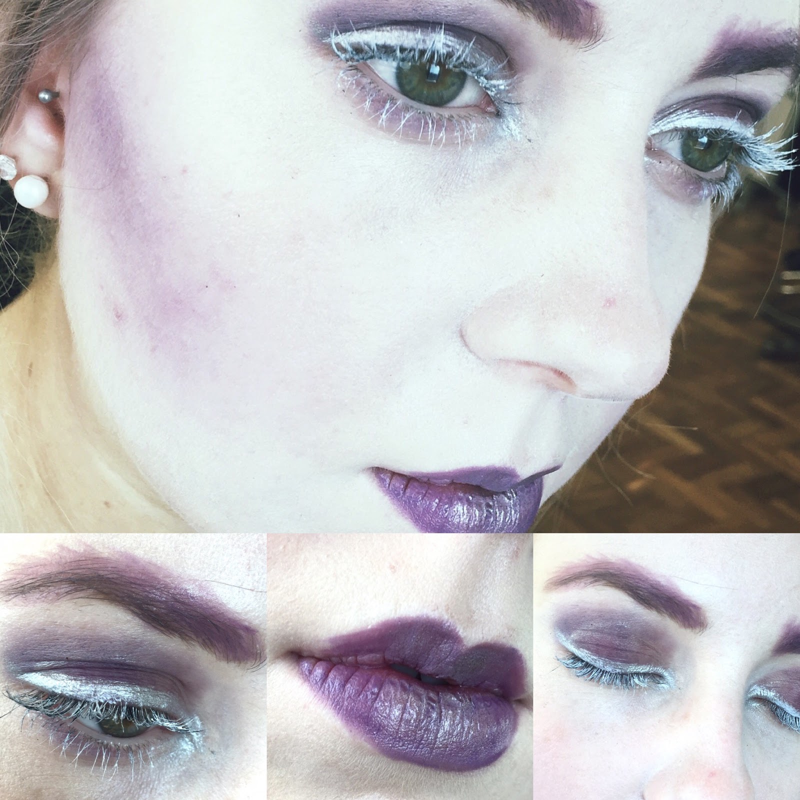
My design centred around the colour purple. I wanted to create a bold and striking look with a rich colour. By using a monochromatic scheme, this allowed me to soften some aspects of the faces with lighter shades. In regards to the Elizabethans, this colour was not used on the face but the colour is often associated with royalty or privileged people and I wanted to incorporate this onto the complexion to reflect this.

For the eyes I used the same shades from the V2 palette all over the lid and slightly underneath to create a smokey look. I painted the lashes with the white base to produce the 'white mascara' look to draw attention to the eyes. Silver (Illamasqua Liquid Metal - Phenomena) was added to the lash line to emphasise the eyes further. The brows were achieved by using the purple grease paint to shape them and the purple eyeshadows to set the eyebrows. I decided to make the eyebrows seem bigger and messier by using my angled brush and extending the 'hairs'. The final look of the brows ended up being quite graphic and artistic which I think makes the makeup design have more depth and adds an edge to the softness of the purple shades already on the face.
I painted the lips in the same purple greasepaint shade and added the liquid metal silver eye paint in the centre to add shine and further dimension to the lips.
If I were to re-create this design, I would improve the coverage of the base to make Beth's skin completely flawless and even. To further dramatise the eyes, I would extend the eyeshadow further than the crease and potentially up to the brows or further out towards the temples. However, I am happy with my first attempt as it gave me the opportunity to test out products and complete a look on an actual model's face. I would've liked more time to complete the look to create a more polished final makeup look.
0 comments:
Post a Comment