Elizabethan Society - Who Wore The Makeup?


The Elizabethan era is associated with Queen Elizabeth I's reign through 1558–1603 and is considered to be the Golden Age in England. 

Elizabethan attitudes towards women were shaped often by the tales and ideals drawn from the bible, however, it was becoming a time daughters were inheriting estates and a woman could be queen - although parliament named Elizabeth supreme governor, not supreme head, of the English church (Doran and Jones, 2014). Women of this time were still expected to marry to increase the wealth of their family. Careers were almost non-existent for women and in homes they were seen as inferior to men (Alchin, 2012). Ideal female behaviour suggested that women would be chaste, quiet and obedient. Marriage was expected of all women to be dependant on their male relatives and produce children (preferably males). Some women did manage to negotiate these terms to exercise degrees of independence through passing on successful wills demonstrating their wealth they have collected from the family and distributed it to their heirs. The icon of the era Queen Elizabeth herself, however, made it clear in a public announcement that she was exceptional and did not consider herself a model for other women (Doran and Jones, 2014). Looking back on this historically, it is very ironic how she was the model for makeup and hair throughout her reign and afterwards.

Family life for men in the 1500's was a life of power. They made decisions and orders, expected to be followed by their wives, but also were expected to support their families. A man's earnings would go towards making their children wealthier and improving their social positions for them when they were older. (Alchin, 2012). If a man were to become a widow in this era, he would indefinitely look to remarry (especially if he has children). In a sense, this hastiness removes any importance or love for the previous mother, wife and woman. This reflects the nature of the society between 1550 and 1600.

References

Analogous, Complimentary and Monochromatic Face Charts

Health and safety:
  • Cover model
  • Check for contact lenses
  • Check for and ask model about any skin complaints or allergies
  • When applying shadows or mascaras, ask model to close eyes and work carefully
  • Make sure all brushes are clean
  • Wash hands
  • Do not double dip with products
Products used:
  • Illamasqua Matte Primer
  • Illamasqua Skin Base in 1
  • Kryolan Concealer Camouflage Palette
  • Kryolan Classic Blush Palette
  • Kryolan Lip Rouge Palette
  • Foundation Brush
  • Kabuki Brush
  • Powder Brush
  • Angled Brush
                          Monochromatic
In my first design, I wanted to include the Elizabethan theme in the colour palette. Using various shades of red, I created a simple but graphic and sharp-looking style. Reflecting the Elizabethan style, I wanted to create a very pale complexion. To produce this, I mixed Illamasqua's Matte Primer, Skin Base in 1 the D4 concealer from Kryolan's camouflage palette and applied this to Phoebe's face and lips. For the contour, I started by creating a harsh red line using Kryolan's Youth Red blush and blended it out multiple times after applying more layers. This technique meant the cheekbones were strikingly contoured but there were no noticeably harsh lines. The bold eyeliner was a mix of Kryolan's Lip Rouge in LC152 and LCO1O which is also the same shade I mixed for the heart shape on the lips. 

After creating this look, I discovered the mixture used for the base on Phoebe's skin is my favourite so far for a modern Elizabethan look. The reason for this is that it left a light and demi-matte finish that looked airbrushed and youthful. If I were to re-create this exact look again, I would make the eyeliner less curved and more linear. I would also either make the eyebrows red to match the look or cover them up completely.

Products used:

  • Illamasqua Matte Primer
  • Illamasqua Skin Base in 1
  • Kryolan Concealer Camouflage Palette
  • Kryolan Brights V2 Eyeshadow Palette
  • Illamasqua Liquid Metals Palette

Analogous
Yellow was my chosen colour to use for the 'neighbouring colours' scheme so I could use oranges and hints of gold. My face chart design was very soft and the emphasis was left on the lips so I wanted to make sure this was reflected when it was recreated on my face.

To begin with, I used the same mixture for the base and the design above and concealed under the eyes with D1 + D3 (Kryolan Camouflage palette) to lighten my face under the eyes and on the cheekbones to make sure I had a flawless base. A combination of the orange and yellow shades were when I created a colourful yet subtle smokey eye look. I used a small amount of the gold shade from the Illamasqua Liquid Metals palette to line underneath my lash line. This shade was also used all over my lip. My cheeks were softly contoured with a mixture of orange shadows.

I loved the softness of this look, leaving the emphasis on one area of the face, so I would definitely look into incorporating these techniques into my New Elizabethan design.

Products used:

  • Illamasqua Matte Primer
  • Kryolan Ultrafoundation in Ivory
  • Illamasqua Skin Base in 1
  • Kryolan Supracolour Palette
  • Kryolan Brights V2 Eyeshadow Palette
  • MAC Pigment in Reflect Gold

Complimentary
My final look I designed aimed to be a contrasting and eye-catching look. The base was similar to the two other looks, but instead of mixing concealer I used the Ultrafoundation in Ivory with the Skin Base to make a thicker and more flawless finish. To create the harsh and defining contour I used TK2 and BL10 from the Supracolour palette to achieve a bold blue shade. I carried the contour up onto the temples and under the jaw to define the face. Blue shades for the V2 Kryolan palette were used across Phoebe's lid and I added Mac's Gold Reflex pigment in the inner corner to add more dimension and some shine to the design. Orange shadows from the colour eyeshadow palette were used under the lashes and on the cheeks for blush. To complete the look, I used 288 from the Supracolour palette all over her lips.

I am very pleased with the outcome of this look as it is striking and flawless. The skin is very glowly and if this were to be recreated I would like more sheen on the face so would make more used of the Gold Reflex pigment, perhaps on the cheeks for a highlight or in the centre of the lips. Another element of the look I really admire is the contouring. The greasepaint on top of a glowly and flawless base allowed me to blend it easily and the final outcome meant the whole face had a sheen - which has a beautiful finish.

This experience of designing on a proper face chart, choosing suitable products and applying the look has been extremely useful as it is a staple skill I will use from now and throughout my career and this practise has made it easier and given me confidence to do more. The applications on Phoebe's and my face allowed me to also experiment with bases for my Elizabethan design which was also a helpful exercise. 

Applying Bases + Contouring Practise

I have created a short film of me practising the techniques we have learnt in our technical file from the start of term on three different people with different skin types.


Shaping the Face - Contour, Blush and Highlight


Products used:

  • Kryolan Ultrafoundation palette
  • Illamasqua Satin Primer
  • Kryolan Camouflage palette
  • Kryolan Classic Blush palette
  • Illamasqua Sculpting Duo
  • Foundation Brush
  • Kabuki Brush
  • Powder Puff
  • Small Blending Brush
  • Blusher Brush

Health and safety:

  • Cover model
  • Check for contact lenses
  • Ask model about any skin complaints or allergies
  • When applying shadows or mascaras, ask model to close eyes and work carefully
  • Make sure all brushes are clean
  • Do not double dip with products
  • Wash hands

Name: Bronya Leavesley
Age: 20
Hair type: Medium length, blonde hair - dyed
Skin type: Combination/Oily
Skin tone: Light with pink undertones
Eye shape: Even eyes
Allergies: N/A
Contraindication: N/A


At the beginning of our technical session with Sue, we were asked to add the base initally to our partners face to have a blank canvas for the contour and highlight. Bronya has a normal skin type, with tendencies to be dry, that has pink undertones. To approach this, I mixed the lighter yellowy tones from the Kryolan Ultrafoundation Palette and applied it on top of a satin primer. 


To start highlighting process, I mixed concealer shades D1 + D3 from the Kryolan Camouflage Palette that were slightly lighter than her natural skin tone. With this mixture, I applied it in a C shape from under her brow to on top of her cheekbones. I also applied this shade in the centre of her forehead, on the bridge of her nose and her chin. To further accentuate the cheekbones after contour, I added the highlight shade under her cheekbones as well. 

For contour, I used a combination of the medium and dark shades from the Ultrafoundation palette to create the perfect contour shade that would be blend-able and natural looking. I asked Bronya to suck in her cheeks so I could feel her face and place the contour accurately so it only brought out her natural attribute as opposed to changing the shape of her face or distorting it. To apply the colour, I dabbed it with my finger and blended it out with the aid of a small rounded brush. I brought that same colour up to the temples, on the sides of the nose and under her jaw. All those areas are not always necessary to cover but for this practise session I wanted to explore the results.

A combination of the pink shades from the Kryolan Classic Blush palette was used on Bronya's cheeks. To finish off the face, I applied the highlight shade from the Illamasqua Sculpting Duo on the tops of her cheekbones and powdered her face. 


I feel like this attempt was successful as her face does not look heavily covered by makeup and the contour does not look 'muddy'. In future, I would apply the blusher less heavily as in real life her cheeks were very flushed before I applied another layer of powder! This skill has been one of my favourites to perfect and will be useful in any makeup look.

Status Symbols in the Modern World

In the 21st Century, it has recently become a trend to flaunt your status. Traditionally throughout history, this has been portrayed through wealth in portraits, stories and films. In the last decade, status symbols in modern society can be seen in many different ways – some more subtle than others. These sort of symbols are important to take into account when design a 'New' Elizabethan look.


The first image above is Kylie Jenner displaying her wrist covered in 'arm candy' on the social media platform Instagram. To any normal onlooker they would admire the bracelets and move on. After studying the image for longer and researching the logo, it becomes clear that the Cartier 'love bracelets' on her wrist are worth $32,650 on one wrist alone. Kylie Jenner has risen to fame through the Kardashian family and brand and this single image demonstrates the kind of status and wealth the youngest member (at 18) has in modern society.

Other obvious displays of status are high-end, labeled clothing and accessory brands. Louboutin heels have been a huge trend since 2007 and wealthy people will splash out £450 on average for a plain patent pair of stilettos – with the red on the underneath of the shoe. Flashing the red sole of the shoe flaunts somebody's social status even when they are just walking down the street. Handbags are another very popular symbol of status. Highly desired handbags are designed by Prada and can be bought for around £1,050 for a leather tote. These kinds of symbols are traditional ways to demonstrate the fact you have money and this has been used throughout history with objects such as diamonds, gold and family heirlooms.

Less obvious examples of status symbols would be the choice of your life partner. Celebrities like Angelia Jolie and Brad Pitt are a prime example of an extremely wealthy family, high up in societies hierarchy in the 'celebrity' world, that almost show off their status through their attractiveness. Their worth, wealth and looks correlate with their high status. The power of your partner could also symbolise your status in society. Michelle Obama is married to the most powerful man in the USA and this obviously shows her and her families high status in the world. These aspects of modern social symbols could hark back to historical icons like Henry VI marrying multiple attractive woman to create powerful male offsprings or portraits created of royalty to show their power over their realms.


A very contemporary and recent trend of social status is a 'green' lifestyle' and social media plays a massive part in displaying this. Being healthy and having a 'good body' has always been a trend, but in recent months crazes for diet teas and green detox smoothies have taken off. Being able to afford and maintain this sort of lifestyle (whilst photographing and uploading to social media platforms) is subtle way of showing your social status. In Elizabethan times, changes to your diet like spoiling the stomach with dirt and coal to make your skin pale or painting your face with toxic concoctions showed your inspiration from the Queen's wealth and status.

The final two images represent more modern but more obvious shows of social status. Expensive cars reflect great wealth and have been a sign of this since cars were first invented. A 'fit' and 'healthy' body is an extension of the green lifestyle and attractive partners but is the ideal for the public to look up too and achieve through expensive clothes and personal trainers. All of these are often displayed through wealthy people or the celebrities of the modern world and therefore have become public and iconic status symbols of the modern world. For my project, I will look into ways of incorporating this research mixed with the traditional Elizabethan symbols to optimise the New Elizabeth theme.

Reflection in Lesson 21/10/15

In this session, we had the opportunity to share our blogs and peer assessment our work so far with a partner. With checklists, we confirmed what has been done and what needs to be caught up on. This is the first time I have shared my work with someone in my class so it was a great opportunity to get positive and negative feedback from a classmate in the same situation.

I went through each blog post with Bronya and explained the piece of written work, photos and why I had presented it in a certain way. I have a few blog posts missing so far, but with Bronya's help I was able to gather so good ideas to get these up to date and well-constructed. It was an enjoyable experience as well as helpful because I was able to show the work I was proud of and my further work outside of university researching makeup designers that I admire. The most helpful aspect of this session was Bronya's evaluation, feedback and targets for my work and sketchblog.

Overall, Bronya confirmed she thought my sketchblog and content was a C2. The aspects that were 'satisfactory' were range of sources as I have only used books and the internet (I have not yet extended this to journals, films or videos) and my understanding of relevant historical practise, theories and current practises as I am still getting familiar with becoming a makeup researcher, artist and designer! For my practical and professional skills, I was rated between upper second and lower second (competent and basic) for the required specialised skills and achieved upper second for my communication skills.


Bronya's personal feedback for my sketchblog was 'the blog is detailed and set out nicely with a good use of visual imagery as well as you going out of your way to find more inspiration to support your work'. The three following targets were also set by Bronya to help improve my work:

  • Could use a range of different sources to support work and reference properly
  • Finish all required work
  • Practise more of your work outside of class

Elizabethan and Contemporary Portraits

The Ermine Portrait - Queen Elizabeth I

Painted by Nicholas Hilliard in 1585, the Ermine Portrait was one of thousands of paintings of the iconic monarch throughout her reign. The 'cult of Elizabeth' used portraiture of Queen Elizabeth I to reflect her love for her country and flaunt her chastity. The variations showed her love of peace and victory as well as keeping the virginal ideal forever in the minds of the viewers. These detailed images were the inspiration for the people of her time. 

Hilliard's particular interpretation of the red-headed queen entails many various symbols that help portray Elizabeth to the country. The Ermine sat on her arm (and interestingly titles the portrait) would've been highly valuable in the 16th century and is a symbol of royalty and high nobility. Her bejewelled black gown highlight her seriousness but also the colour contrasts her pale complexion massively drawing the viewers eye to her face instantly. It is almost as though gravity is drawn towards her in this image. The olive branch in her hand represents peace and the sword beside her shows her preparation to protect her realm and keep justice in place.

Mrs Carter Tour Promotion - Beyonce Knowles-Carter


The promotional content used for the Mrs Carter World tour distributed between in 2013 and 2014 demonstrates Beyonce's status as a musical icon of the 21st Century. Since making a name for herself in the late 1990's as a lead singer in Destiny's Child, Beyonce Knowles is known worldwide and is an icon of beauty for many people. As she is not stereotypically 'thin', she is respected for demonstrating a womanly figure throughout her career and inspires women through her music. In many images of her, sexuality is used to promote herself and is used as a tool to catch the eye of both men and women. 

Within this photograph, many objects are symbolising her wealth, status and womanhood. The crown traditionally is recognised as a sign of royalty, however, Beyonce's is lopsided on her hair - potentially symbolising the unconventional royalty of celebrities in the modern day. The golden corset demonstrates the womanly curves Beyonce is known for. Corsets are used to train the waists into a desired shape for aesthetic purposes and could be demonstrating the pressure on women to maintain this idealised body. Her red over-the-knee boots symbolise her sexuality. Draped over her body, the royal blue gown-like jacket contrasts the gold aspects of her outfit - highlighting them.

Monochromatic Design on a White Base


Products used:

  • Kryolan Supracolour Palette
  • Illamasqua Loose Powder in 010
  • Kryolan Eye Shadow Variety Palette in V2
  • Illamasqua Liquid Metal Palette
  • Foundation Brush
  • Kabuki Brush
  • Powder Brush
  • Blending Brush
  • Disposable Mascara Wand
  • Angled Brush
Health and safety:
  • Cover model
  • Check for contact lenses
  • Check for and ask model about any skin complaints or allergies
  • When applying shadows or mascaras, ask model to close eyes and work carefully
  • Make sure all brushes are clean
  • Wash hands
  • Do not double dip with product


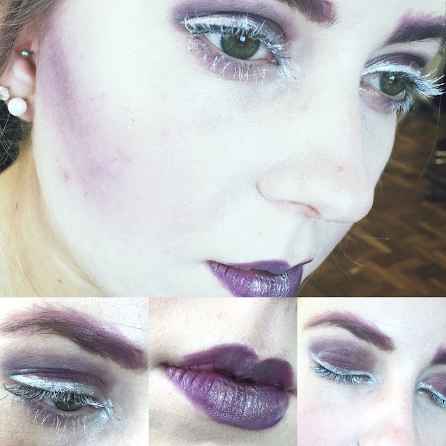
My design centred around the colour purple. I wanted to create a bold and striking look with a rich colour. By using a monochromatic scheme, this allowed me to soften some aspects of the faces with lighter shades. In regards to the Elizabethans, this colour was not used on the face but the colour is often associated with royalty or privileged people and I wanted to incorporate this onto the complexion to reflect this. 


To begin this design I used Kryolan Supracolour in White mixed with the Illamasqua Matte Primer to create the desired base. I chose this combination following our experiments in our 'bases' lesson as, even with the matte primer, the skin is still glowly and radiant and lasts longer with the chosen primer. For contouring, I wanted to create a strong shadow to sculpt Beth's face. I began by applying a purple shade of Supracolour and using a kabuki brush to buff out the harsh line. Kat advised me that using a powder will make achieving a softly blended look much easier. Following that, I decided to use a mixture of the purple shades from the Kryolan V2 Eye Colour Palette to blend out the colour further. Looking back on the final images, I feel it could be improved by extending the colour further across and under the cheekbones so the coloured line would be even less harsh, as well as bringing the colour up to the temples and under the jaw to make the colour look less random on the face.

For the eyes I used the same shades from the V2 palette all over the lid and slightly underneath to create a smokey look. I painted the lashes with the white base to produce the 'white mascara' look to draw attention to the eyes. Silver (Illamasqua Liquid Metal - Phenomena) was added to the lash line to emphasise the eyes further. The brows were achieved by using the purple grease paint to shape them and the purple eyeshadows to set the eyebrows. I decided to make the eyebrows seem bigger and messier by using my angled brush and extending the 'hairs'. The final look of the brows ended up being quite graphic and artistic which I think makes the makeup design have more depth and adds an edge to the softness of the purple shades already on the face. 

I painted the lips in the same purple greasepaint shade and added the liquid metal silver eye paint in the centre to add shine and further dimension to the lips. 

If I were to re-create this design, I would improve the coverage of the base to make Beth's skin completely flawless and even. To further dramatise the eyes, I would extend the eyeshadow further than the crease and potentially up to the brows or further out towards the temples. However, I am happy with my first attempt as it gave me the opportunity to test out products and complete a look on an actual model's face. I would've liked more time to complete the look to create a more polished final makeup look.

Pat McGrath Inspiration - New Elizabethan Makeup Ideas

One of the most inspiring artists in my eyes is Pat McGrath. She is one of the most influential and well-respected makeup designers of the 21st century. In various seasons and years, her catwalk shows have incorporated reminisces of the Elizabethans whilst adding her own personal contemporary and stylistic twist. Her designs and influences will aid me in my project to create more versatile and original makeup looks.

Christian Dior Spring 2006

This look created in 2006 is reminiscent of the Elizabethans through the pale complexion and white eyebrows. Pat's technique with the eyeshadow is a simple but effective one, using one colour around the eye shape (leaving a slight white space) to emphasise the eyes. Elizabethan's were desperate for a youthful and juvenile look and having bright and big eyes was one way to achieve this. Having the focus on 'youthful' parts of the face may be a good way to incorporate the Elizabethan era into a modern technique.  


Givenchy Spring 2010

Another catwalk look from Pat McGrath incorporates the Elizabethan style through the eyebrows (or the no eyebrows!) but also with the red lips. The cheeks and lips were often tinged with a pink or red in the Elizabethan times to reflect young skin and energy. Givenchy's makeup design also leaves the focus on the eyes by using glitter to bring light to the area. These two areas would be good places to focus on in my New Elizabethan design to create a striking and youthful look.


Dior S/S 2014

McGrath's approach for Dior in 2014 involves placing the emphasis fully on the eyebrows in a subtle manner. Although the eyebrows become the centre of the look, the use of gold shimmer makes them more neutral on paler skin (as opposed to a bold brow that is fashionable in recent years). This could a different angle to incorporate in a contemporary tudor look.


Alexander McQueen F/W 2014

More recently, Pat McGarth worked in collaboration with Alexander McQueen to produce another subtlety Elizabethan-inspired makeup look. The eyebrows, again, are non-existent and the skin is left glowing and youthful. I chose to include this look in my research as I really admire the softness used on the eyes, even though rich tones of bronze and gold are used. These colours are associated with wealth and may be colours royalty, like Queen Elizabeth, would use today. The cheeks are also tinged with a light pink. McGrath's soft application in this look is one I would like to attempt and play around with in my designs as it produces an effective youthful but modern look.

Modern Elizabethans Bases

In the lesson with Kat today we were experimenting modern foundations, brushes and techniques to decide on a base that we would find best to work with for our New Elizabethan makeup design.  

Products used:

  • Illamasqua Skin Base in 1
  • Kryolan Aquacolour
  • Kryolan Supracolour
  • Illamasqua Matte Primer
  • Illamasqua Satin Primer
  • Foundation Brush
  • Kabuki Brush
  • Powder Puff

Health and safety:
  • Cover model
  • Check for contact lenses
  • Ask model about any skin complaints or allergies
  • Make sure all brushes are clean
  • Do not double dip with products

Illamasqua Skin Base

For the first trial, I used a matte primer to ready Beth's face for the application of the Skin Base (in shade 1). I decided to use the matte primer for this application as my research has shown me that often the finish of the complexions were almost dusty and chalky following the concoction of materials that were used of Elizabethan women's faces. After applying the Illamasqua Matte Primer with a foundation brush, I then proceeded to apply the Skin Base with the same brush. As I applied it, the base was quite streaky and sheer but I buffed it in soon after with a kabuki brush to even out the skin and work the base into Beth's complexion. It became a sheer-to-medium coverage, however, it was not build-able at all as I went to put another layer on, the previous layer of white would brush straight off. Finishing the look off, I used the Illamasqua Loose Powder and this helped to achieve the powdery/dusty look I was aiming for and allowed the base to set for further powder products (if needed). I feel like this is definitely an option to use for my contemporary Elizabethan look as the slightly lighter finish is a more modern look I prefer, but I do feel a heavier base would be a more effective way of tying in the Elizabethan theme. 

Kryolan Aquacolour


I became the model for the second experiment and we used a water-activated base. Beth used a matte primer to begin with on my face. As Beth started to mix the white colour with water, we both were not sure what the ratio between the two should be. Beth dipped her brush into a small bit of water to mix a reasonably thick consistency. The base was applied with a foundation brush and we found the mixture dried very quickly and became hard to work with. Streaks appeared so Beth attempted to buff the product into my skin, however, as the aquacolour had dried the product started to crumble off. With more practise, this method would become effective, however, the coverage and application was not the best we tried in this lesson.


Kryolan Suprabase

Chloe applied the third chosen base onto my face. We chose to try the Illamasqua Satin Primer as a base for the colour. The application of the Suprabase became difficult for Chloe as the primer had not sunk into my skin and the texture of the satin primer made the grease-based product slide around my face. This left the finish very sheer and glowy. This was not the intended result, so Beth and I attempted it again at the end of the lesson.


For the second attempt, Beth applied the Matte Skin Base to begin with and let it sink into my skin. Beth then proceeded to add the Suprabase with a foundation brush and buffed it in with her kabuki brush. The finish was then medium-high coverage and yet still added a sheen to the skin. This approach became Beth's and mine favourite technique and finish. White dominates the face and adds the Elizabethan complexion to the model but also has the contemporary trend of glowing skin - tying the two together and creating the perfect New Elizabethan base. 

The process of trialling and testing base products on each other and becoming the model are both two new things I have never experienced before. The experiments with different bases and their formulas has given me the confidence to judge what type would be suitable for a client and the brief. I also became more familiar with the types of brushes to use and when to use a setting powder to create the desired finish. Being the model for Beth and Chloe gave me the opportunity to understand the pressure that is applied and the help I can give to my peers throughout the process.

Queen Elizabeth I - Key Films and Actors

From the mid 20th century up until now, Queen Elizabeth I has been an icon to portray through film. Various actresses have taken on the role and made it their own over the past 50 years. Each take on the Queen involves a new makeup and hair design and each will be great inspiration to create my own, original look for a contemporary version.

Mary of Scotland (1936)


Florence Eldridge (1936)
Florence Eldridge portrayed Elizabeth Tudor along side Katharine Hepburn as Mary Stuart. Eldridge plays Elizabeth in the portion of her life where her half-sister Mary is ruling the country. As Elizabeth progresses into Queen of England, she gains the elaborate clothing, jewels and the quintessential heart shaped curls with a crown on top. The makeup is simple (but hard to distinguish with the black & white film) with dark lips, however, the eyebrows are present with a simple line.

The Virgin Queen (1955)
Bette Davis (1955)

In 1955, Bette Davis plays the wrathful Queen Elizabeth caught in a love triangle between Sir Walter Raleigh, lady-in-waiting Beth and herself. The amplified colours used in Davis' hair and makeup reflects the lust and power involved in the themes of this film. Almost 20 years after Mary of Scotland, the makeup has developed and changed slightly with the eyebrows being very rounded and a bleach blonde shade - demonstrating the trend of overly plucked brows and hair lines. The wig used is a matching shade of orange as the lips and using orange is a creative twist on the standard red. Davis' (aged 47 in this film) is also showing a more versatile look of middle age - when Elizabeth had most of her power.


Elizabeth (1998)


One of the most well-known contemporary telling of Queen Elizabeth I is the 1998 film Elizabeth. Cate Blanchett shows the progressive journey from young woman to queen. The makeup iconally changes at the end when she proclaims 'I have become a Virgin' and is 'married to England', she has a very pale complexion, rouge-tinged cheeks matched with a pale pink lip. The eyebrows in the 1998 interpretation are non-existent and the wigs created accentuate the high hair line too.


Shakespeare in Love (1998)


In the same year as Elizabeth, Shakespeare in Love was released with Judi Dench as a starring role. Elaborately dressed as Queen Elizabeth I, she is involved in the romantic story of William Shakespeare falling in love. Her makeup is very reflective of the youthful attempt to stay young through a mask of white and red shades of colour. The eyebrows are dull, cheeks are very rosy and lips are pale. Again, in this 1998 production the hair is very accurate with the tight curly frizz in a heart shaped wig. 

The Virgin Queen (2005)


Anne-Marie Duff portrayed Elizabeth Tudor in 2005. This adaptation of Elizabeth's life covers all major ages - from her fearful days as a teenager to her elder years as queen. This image shown here from the chapter of her coronation shows a varied makeup look to the other examples showed above. Her hair is a strawberry-blonde as opposed to a fiery red. There is barely any remains of make-up apart from the pale complexion. This film is a great example for transformation within makeup as it shows all portions of her life.


The Tudors (2009-2010)


BBC produced the Tudors between 2007 and 2010. The role of Elizabeth Tudor was introduced in 2009 as is played by a young girl named Claire MacCauley. At this age in the tv series, Elizabeth has no makeup on, however, the young girl wears a soft crown of flowers to show her royalty. As the character develops into her teenage years, Laoise Murray takes over the role. At this point, her complexion is much more white but the hair is still light and kept up with a floral crown. The glowing skin is a contemporary take on the Elizabethan techniques.

Anonymous (2011)


In the most recent portrayal of Elizabeth I's life, Joely Richardson and Vanessa Redgrave share the role to play portions of her adult life. The makeup for both women is simple with a pale skin tone and light eyebrows. As she is portrayed to have aged with Redgrave's scenes, more rouge is added onto the cheeks - potentially the attempt to layer more makeup to remove young. The choice to use to adults and develop the story and makeup with them is original and a exciting way to experiment with different faces.

Tudor Cosmetics and the Dangers

Queen Elizabeth I inspired a nation into using the new variations of cosmetics used within her extreme looks. 'Along with her red wigs, Elizabeth wore the fashionable red and white paint on her exposed skin, and the older she got, the more she painted' (Corson, 2003) demonstrating the length she would gone to remain looking youthful, and this is reflected in the extremities the Elizabethan woman may implement in their beauty regime. 

One of the most commonly practised techniques of creating a pale complexion was by using ceruse, or a white lead, which was very dangerous for human skin. (Gunn, 1973). This paleness implied healthiness and wealth as you would not be working out in the sunlight and could afford servants and staff to complete your daily jobs, so theoretically the skin would stay young and plump forever for the rich. This did not turn out to be the case as it known that as Elizabethan aged, she would use a concoction of ass's milk, hog lard and beeswax for the production of lotions and coated her face in egg whites so her makeup would not crack or smudge. The image from Fenja Gunn's The Artificial Face demonstrates details a further bizarre cosmetic fashion. Veins were painted on the forehead which was presumably introduced to simulate a youthful, translucent complexion.

To achieve the pale complexion, some severe measures were taken by Elizabethan women. Many would 'swallow gravel, ashes, coals, dust, tallow candles, labour and toil themselves to spoil their stomach, only to get a pale-bleak colour'. Women who preferred not to use the dangerous pastes to whiten their skin were advised to wash in their own urine or wine (Corson, 2003). These ideals show the utmost lengths people would go to have a cosmetic look like Queen Elizabeth. 


Juvenile and youthful young women were the inspirations, primarily for Elizabeth Tudor, of their cosmetic looks. The ideal face would have a basic colour palette of white, pink and red. This portrait of a young woman (identified as a maid-of-honour to Elizabeth I) demonstrates the standards of beauty that are trying to be achieved through the Elizabethan makeup trend - hair of red and amber shades and soft bone structure. (Ribeiro, 2011). There is barely any eye makeup used, apart from a touch of pink shadow. It was important for the eyes to be large and well-shaped (potentially why the eyebrows were also overly-plucked to leave the emphasis on the eyes). It seems as though the production of tudor cosmetics and the makeup craze of pale complexions and blushed cheeks stemmed from the young women that elder ladies so desired to be throughout their existence

Elizabethan Cosmetic Recipes


  • To make the complexion white: 'Take leaves and roots of nettle and boil them in water and with this water wash your hands and face and they will become white and soft.'
  • To reduce redness in the face: 'Take white lead, rose water and violet oil and mix together and anoint the face.'
  • Powder to make teeth white: 'Take coral and rock alum burned and ground very well and pass through a sieve and use'
  • To make hair and body hair grow: 'Take borax water, fumitory water, water of plantain and with this water wash where you want and take a comb comb and comb very well.'

References

  • Aileen Ribeiro. 2011. Facing Beauty, Painted Women & Cosmetic Art. Published by Aileen Riberio (U.S). Chapter: Renaissance 78-82.
  • Fenja Gunn. 1973. The Artifical Face, A History of Cosmetics. Published by David & Charles (London). Chapter: Late Fifteeth and Sixteeth Centuries 70-88
  • Richard Corson. 2003. Fashions in Makeup, From Ancient to Modern Times. Published by Peter Owen Publishers (London.) Third Edition. Chapter: Elizabethan Days 101-113
  • Jill Burke. 2011. 'Making Up The Renaissance' [14th October 2015] Available from: https://sites.eca.ed.ac.uk/renaissancecosmetics/

Applying Bases

In this lesson, Sue took us through the steps to produce the perfect base on your client. We needed to get to grips with colour matching, coverage, brushes and setting the products used.

Consultation notes:
Name: Beth Haile
Age: 18
Hair Type: Light blonde (dyed) medium length
Skin Type: Combination/Oily
Skin Tone: Light with pink undertones
Eye Colour and Shape: Green/Brown and round and even shape
Allergies: N/A
Contradictions: N/A

Application Process and 1st Attempt in Class

  • Wash hands, including back of hands to use as a palette to mix colours
  • For primer, you can optionally mix primer with base or apply primer then base (for my attempt demonstrated below, I applied a primer with a foundation brush and then the foundation with the same brush)
  • Do not double dip, spatulas are used to pick up product and place on palette and then disposed of
  • Start in the middle of the face and work out, working the loaded brush backwards and forwards repeatedly
  • Lift models head to cover the neck with the same colour of base
  • Make sure ears are covered with base and be careful around piercings
  • Take a smaller brush around the eyes and nose (for eyes, go right up to lash line to make sure colour of face is even all over)
  • After applying the base with a foundation brush, buff over skin firmly with kabuki brush to make sure the foundation is worked into skin
  • Apply a shade of concealer that is one or two shades lighter than your chosen base colour - you can mix concealer with cream foundation to make mixture smoother to apply. Only use light reflecting concealer under eyes, not on blemishes. Push concealer onto blemishes with the brush to make sure redness is covered
  • Roll the powder puff in the translucent powder and apply under eyes, down the nose and forehead (if you are working with an oily base, apply all over) to remove shine and set the base.
1st image: Beth's skin cleansed and moisturised for a clean base. 2nd image: Finished base application.
3rd image: Beth's face in the mirror and makeup side lighting to show the satin and glowing finish of the base.
Products used on Beth's face

  • Illamasqua Satin Primer
  • Kryolan Cream Ultrafoundation in Ivory and FS 38
  • Kryolan Dermacolour Camouflage Concealer in D1 and D4
  • Illamasqua Loose Powder in LP 010

For the bases (or foundations), the overall finish should be a perfect match to their models skin tone and therefore should barely be noticeable. If the person I'm working on has varied skin tones across the neck and face, the foundation should match the majority colour and then the skin will be evened out to create a flawless finish. As the make up artist, the face must not touched with fingers while applying the base as the heat from the hand can melt away the cream products and the finish with be unflattering (a puff or cotton can be used to rest on whilst touching the face). The formula of the bases must be taken into account with the situation or location - waterproof bases for rainy or wet locations and SPF bases and sun block for hot and sunny situations.

When applying the base, it is advised to add the product all over face and neck and buff the product in with a kabuki brush to remove any lines and perfect the finish of the foundation. Following that, you then should apply concealer (and if needed buff again) otherwise if you conceal before the base and then apply again the base will become too heavy and cakey. Powder is applied after the cream products to remove shine and set the products to last. The eyelids must be powdered as well to make sure there are no harsh lines from creasing. If I wanted to use cream products after the base has been applied - for example, cream blusher or contour - then I would not powder the face until the very end to avoid difficult application of mixing a cream product on top of powder. The neck and under the nose must also be covered by foundation or concealer in case a camera needs to come up close and personal. 

Colour Theory and 1st Face Chart

The 'Prismatic Colour Wheel' by Moses Harris (c. 1788)
The colour theory is an important tool to apply within the world of makeup design. Colours possess properties that can produce different sensations for people through their eyes as a result of reflection and the way colour emits light. It can influence human behaviour and mental psyche. Certain attributes can affect these influences - for example: the lightness, saturation and hues of the colours. 

On colour wheels, you can have harmonious and contrasting colours. Harmonious colours are neighbouring colours on the colours wheels e.g blue, blue-purple, purple and red-purple. Contrasting colours are opposite to each other e.g orange and blue or red and green. 

Further variations of these categories are monochromatic, analogous and complimentary.


Monochromatic means variations or different shades of the same colour. The diagram above shows in this case, all the variations of the shade red would be picked. Analogous colours are much like the harmonious colours I described above as they are the neighbouring colours. For yellow, you would pick a light green and orange from either side of the colour wheel to use as your colour palette. Analogous schemes will provoke a calmer emotion for the viewer and makeup looks will be softer and more subdued. Complementary colours are the contrasting shades. These colours will achieve a striking makeup look and a more exciting reaction for the viewer.

If you were looking to use 'grayscale' as a colour scheme, that would be called achromatic. Taupes and beiges (shades often used for foundations and concealers) are neutral colours. Chromatic colours are the pure colours on their own. For all colours, they can be cool or warm tones. A makeup example for these two tones would be Mac Lipsticks 'Ruby Woo' and 'Russian Red'. The photo shows how Ruby Woo has blue undertones making it a cooler shade of red. For the other shade Russian Red, it does not have a blue undertone and instead has a slight orange base to create this classic red colour, which is a warmer shade. 

1st Face Chart
In this lesson, we were also asked to try and produce our first face chart. We have not yet received our proper face charts, so today we worked on standard A4 paper with a face template. I have never used a face chart before so this was a very useful task to get to grips with the technique of using your brushes, creams and powders on a 2D surface. I found it difficult at first to blend in the cream Kroylan foundation without leaving harsh brush lines, but I managed to use a lighter hand and less product to build up a natural looking base on paper. 

There was no brief for our first attempt and so we had the freedom to create whatever look we desired. Following our lesson on the colour theory, I wanted to incorporate the monochromatic technique of using variations of one colour. I used shades of purple on the eyes and created a deep, vampiric, berry purple shade for the lips (with a pale complexion and contoured cheeks). For the eyes I used the neutral Mac palette and started with 'Cozy Grey' for the lid and all over base, 'Blackberry' (a purple) in the outer corner of the eye and deepened the crease with 'Brun' (deep brown) to smoke out the purple shade. I proceeded to add 'After Dusk' (a shimmery purple) across the lid to add more variations of purple, however, the plain paper did not allow me to press the purple shimmer into the page very well. I used a mixture of the 'Blackberry' and 'Brun' under the lash line and on the upper lash line to complete the eye look. For the lips, I applied 'LC 010' (from the Kryolan lip rouge palette). For this particular look I was creating, the colour was not a deep enough purple, so I pushed on the 'Blackberry' eyeshadow over the top to complete this monochromatic purple makeup look. 
Powered by Blogger.
Back to Top